Class WSuggestionPopup
This widget may be associated with one or more WFormWidgets (typically a
WLineEdit or a WTextArea).
The popup provides the user with suggestions to enter input. The popup can be used by one or
more editors, using forEdit(). The popup will show when the user starts editing the edit field, or when the user
opens the suggestions explicitly using a drop down icon or with the down key. The popup positions
itself intelligently just below or just on top of the edit field. It offers a list of suggestions
that match in some way with the current edit field, and dynamically adjusts this list. The
implementation for matching individual suggestions with the current text is provided through a
JavaScript function. This function may also highlight part(s) of the suggestions to provide
feed-back on how they match.
WSuggestionPopup is an MVC view class, using a simple WStringListModel by default. You
can set a custom model using setModel(). The model can provide different text for the suggestion text (ItemDataRole.Display) and value (getEditRole()). The
member methods clearSuggestions() and addSuggestion() manipulate this model.
By default, the popup implements all filtering client-side. To support large datasets, you may
enable server-side filtering of suggestions based on the input. The server-side filtering may
provide a coarse filtering using a fixed size prefix of the entered text, and complement the
client-side filtering. To enable server-side filtering, use setFilterLength() and listen to filter notification
using the modelFilter() signal. Whenever a filter event is generated you can adjust the
model's content according to the filter (e.g. using a WSortFilterProxyModel). By
using WCompositeWidget#setMaximumSize() you can also limit the maximum height of the popup, in which
case scrolling is supported (similar to a combo-box).
The class is initialized with an WSuggestionPopup.Options struct which configures how suggestion
filtering and result editing is done. Alternatively, you can provide two JavaScript functions,
one for filtering the suggestions, and one for editing the value of the textarea when a
suggestion is selected.
The matcherJS function must have the following JavaScript signature:
 function (editElement) {
 // fetch the location of cursor and current text in the editElement.

 // return a function that matches a given suggestion with the current value of the editElement.
 return function(suggestion) {

 // 1) if suggestion is null, simply return the current text 'value'
 // 2) check suggestion if it matches
 // 3) add highlighting markup to suggestion if necessary

 return { match : ...,      // does the suggestion match ? (boolean)
 suggestion : ...  // modified suggestion with highlighting
 };
 }
 }
The replacerJS function that edits the value has the following JavaScript signature.
 function (editElement, suggestionText, suggestionValue) {
 // editElement is the form element which must be edited.
 // suggestionText is the displayed text for the matched suggestion.
 // suggestionValue is the stored value for the matched suggestion.

 // computed modifiedEditValue and modifiedPos ...

 editElement.value = modifiedEditValue;
 editElement.selectionStart = edit.selectionEnd = modifiedPos;
 }
To style the suggestions, you should style the <span> element inside this widget, and the <span>."sel" element to style the current selection.
Usage example:
 // options for email address suggestions
 WSuggestionPopup.Options contactOptions = new WSuggestionPopup.Options();
 contactOptions.highlightBeginTag = "<b>";
 contactOptions.highlightEndTag = "</b>";
 contactOptions.listSeparator = ','; //for multiple addresses)
 contactOptions.whitespace = " \n";
 contactOptions.wordSeparators = "-., \"@\n;"; //within an address
 contactOptions.appendReplacedText = ", "; //prepare next email address

 WSuggestionPopup popup = new WSuggestionPopup(contactOptions, this);

 WTextArea textEdit = new WTextArea(this);
 popup.forEdit(textEdit);

 // load popup data
 for (int i = 0; i < contacts.size(); ++i)
 popup.addSuggestion(contacts.get(i).formatted(), contacts.get(i).formatted());
Note: This widget is not supposed to be added explicitly, as it is a global widget
(much like WPopupWidget). Managing its lifetime can be achieved with
WContainerWidget::addNew() or WObject::addChild(), where the former uses the latter. Do NOT bind
it to a template using WTemplate#bindWidget(), WTemplate::bindNew() or WLayout#addWidget(). If bound this way, the placeholder is not replaced with the correct list of
suggestions, since this causes the widget to be placed into the widget tree twice. A
screenshot of this example:
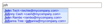
An example WSuggestionPopup (default) | 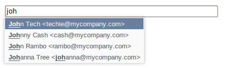
An example WSuggestionPopup (polished) |
When using the DropDownIcon trigger, an additional style class is provided for the edit field:
Wt-suggest-dropdown, which renders the icon to the right inside the edit field. This
class may be used to customize how the drop down icon is rendered.
Note: This widget requires JavaScript support.
-
Nested Class Summary
Nested ClassesModifier and TypeClassDescriptionstatic classA configuration object to generate a matcher and replacer JavaScript function.Nested classes/interfaces inherited from class eu.webtoolkit.jwt.WObject
WObject.FormData -
Constructor Summary
ConstructorsConstructorDescriptionWSuggestionPopup(WSuggestionPopup.Options options) Creates a suggestion popup.WSuggestionPopup(String matcherJS, String replacerJS) Creates a suggestion popup with given matcherJS and replacerJS. -
Method Summary
Modifier and TypeMethodDescriptionSignal emitted when a suggestion was selected.final voidaddSuggestion(CharSequence suggestionText) Adds a new suggestion.voidaddSuggestion(CharSequence suggestionText, CharSequence suggestionValue) Adds a new suggestion.voidClears the list of suggestions.Signal that indicates that the model should be filtered.final voidforEdit(WFormWidget edit) Lets this suggestion popup assist in editing an edit field.final voidforEdit(WFormWidget edit, PopupTrigger trigger, PopupTrigger... triggers) Lets this suggestion popup assist in editing an edit field.voidforEdit(WFormWidget edit, EnumSet<PopupTrigger> triggers) Lets this suggestion popup assist in editing an edit field.static StringCreates a standard matcher JavaScript function.static StringCreates a standard replacer JavaScript function.intReturns the last activated index.intReturns the default value.Returns the role used for editing the line edit.intReturns the filter length.getModel()Returns the data model.voidremoveEdit(WFormWidget edit) Removes the edit field from the list of assisted editors.protected voidrender(EnumSet<RenderFlag> flags) Renders the widget.voidsetAutoSelectEnabled(boolean enabled) When the popup is opened the first item is automatically selected.voidsetDefaultIndex(int row) Sets a default selected value.voidsetDropDownIconUnfiltered(boolean isUnfiltered) When drop down icon is clicked the popup content will be unfiltered.voidsetEditRole(ItemDataRole role) Sets the role used for editing the line edit with a chosen item.voidsetFilterLength(int length) Sets the minimum input length before showing the popup.voidsetModel(WAbstractItemModel model) Sets the model to be used for the suggestions.voidsetModelColumn(int modelColumn) Sets the column in the model to be used for the items.voidshowAt(WFormWidget edit) Shows the suggestion popup at an edit field.Methods inherited from class eu.webtoolkit.jwt.WPopupWidget
getAnchorWidget, getAutoHideDelay, getOrientation, hidden, isTransient, onPathChange, remove, setAnchorWidget, setAnchorWidget, setHidden, setTransient, setTransient, shownMethods inherited from class eu.webtoolkit.jwt.WCompositeWidget
addStyleClass, boxBorder, boxPadding, callJavaScriptMember, doJavaScript, enableAjax, find, findById, getAttributeValue, getBaseZIndex, getChildren, getClearSides, getDecorationStyle, getFloatSide, getHeight, getId, getImplementation, getJavaScriptMember, getLineHeight, getMargin, getMaximumHeight, getMaximumWidth, getMinimumHeight, getMinimumWidth, getObjectName, getOffset, getPositionScheme, getScrollVisibilityMargin, getStyleClass, getTabIndex, getTakeImplementation, getToolTip, getVerticalAlignment, getVerticalAlignmentLength, getWidth, hasFocus, hasStyleClass, isCanReceiveFocus, isDisabled, isEnabled, isHidden, isHiddenKeepsGeometry, isInline, isLoaded, isPopup, isScrollVisibilityEnabled, isScrollVisible, isSetFirstFocus, isThemeStyleEnabled, isVisible, load, propagateSetEnabled, propagateSetVisible, refresh, removeStyleClass, removeWidget, resize, scrollVisibilityChanged, setAttributeValue, setCanReceiveFocus, setClearSides, setDecorationStyle, setDeferredToolTip, setDisabled, setFloatSide, setFocus, setHiddenKeepsGeometry, setId, setImplementation, setInline, setJavaScriptMember, setLineHeight, setMargin, setMaximumSize, setMinimumSize, setObjectName, setOffsets, setPopup, setPositionScheme, setScrollVisibilityEnabled, setScrollVisibilityMargin, setSelectable, setStyleClass, setTabIndex, setThemeStyleEnabled, setToolTip, setVerticalAlignmentMethods inherited from class eu.webtoolkit.jwt.WWidget
acceptDrops, acceptDrops, addCssRule, addCssRule, addJSignal, addStyleClass, animateHide, animateShow, createJavaScript, disable, dropEvent, enable, getDropTouch, getJsRef, getParent, hide, htmlText, isExposed, isGlobalWidget, isLayoutSizeAware, isRendered, layoutSizeChanged, needsRerender, positionAt, positionAt, removeFromParent, removeStyleClass, render, resize, scheduleRender, scheduleRender, scheduleRender, setClearSides, setDeferredToolTip, setFocus, setHeight, setHidden, setLayoutSizeAware, setMargin, setMargin, setMargin, setMargin, setMargin, setOffsets, setOffsets, setOffsets, setOffsets, setOffsets, setToolTip, setVerticalAlignment, setWidth, show, stopAcceptDrops, toggleStyleClass, toggleStyleClass, trMethods inherited from class eu.webtoolkit.jwt.WObject
setFormData
-
Constructor Details
-
WSuggestionPopup
Creates a suggestion popup.The popup using a standard matcher and replacer implementation that is configured using the provided
options. -
WSuggestionPopup
Creates a suggestion popup with given matcherJS and replacerJS.See supra for the expected signature of the matcher and replace JavaScript functions.
-
-
Method Details
-
forEdit
Lets this suggestion popup assist in editing an edit field.A single suggestion popup may assist in several edits by repeated calls of this method.
The
popupTriggerscontrol how editing is triggered (either by the user editing the field by entering keys or by an explicit drop down menu that is shown inside the edit).- See Also:
-
forEdit
Lets this suggestion popup assist in editing an edit field. -
forEdit
Lets this suggestion popup assist in editing an edit field. -
removeEdit
Removes the edit field from the list of assisted editors.The editor will no longer be assisted by this popup widget.
-
showAt
Shows the suggestion popup at an edit field.This is equivalent to the user triggering the suggestion popup to be shown.
-
clearSuggestions
public void clearSuggestions()Clears the list of suggestions.This clears the underlying model.
-
addSuggestion
Adds a new suggestion.This adds an entry to the underlying model. The
suggestionTextis set asItemDataRole.Displayand thesuggestionValue(which is inserted into the edit field on selection) is set asgetEditRole(). -
addSuggestion
Adds a new suggestion. -
setModel
Sets the model to be used for the suggestions.The
modelmay not benull.The default value is a
WStringListModelthat is owned by the suggestion popup.The
ItemDataRole.Displayis used for the suggestion text. ThegetEditRole()is used for the suggestion value, unless empty, in which case the suggestion text is used as value.- See Also:
-
getModel
Returns the data model.- See Also:
-
setModelColumn
public void setModelColumn(int modelColumn) Sets the column in the model to be used for the items.The column
indexin the model will be used to retrieve data.The default value is 0.
- See Also:
-
setDefaultIndex
public void setDefaultIndex(int row) Sets a default selected value.rowis the model row that is selected by default (only if it matches the current input).The default value is -1, indicating no default.
-
getDefaultIndex
public int getDefaultIndex()Returns the default value. -
generateMatcherJS
Creates a standard matcher JavaScript function.This returns a JavaScript function that provides a standard implementation for the matching input, based on the given
options. -
generateReplacerJS
Creates a standard replacer JavaScript function.This returns a JavaScript function that provides a standard implementation for reacting to a match activation, editing the line edit text.
-
setFilterLength
public void setFilterLength(int length) Sets the minimum input length before showing the popup.When the user has typed this much characters,
filterModel()is emitted which allows you to filter the model based on the initial input. The filtering is done as long as the model indicates that results are partial by setting aItemDataRole.StyleClassof "Wt-more-data" on the last item.The default value is 0.
A value of -1 is a equivalent to 0 but filtering is always applied as if the last item always has "Wt-more-data" (for backwards compatibility)
- See Also:
-
getFilterLength
public int getFilterLength()Returns the filter length.- See Also:
-
filterModel
Signal that indicates that the model should be filtered.The argument is the initial input. When
PopupTrigger.Editingis used as edit trigger, its length will always equal thegetFilterLength(). WhenPopupTrigger.DropDownIconis used as edit trigger, the input length may be less thangetFilterLength(), and the the signal will be called repeatedly as the user provides more input.For example, if you are using a
WSortFilterProxyModel, you could react to this signal with:public filterSuggestions(String filter) { proxyModel.setFilterRegExp(filter + ".*"); } -
activated
Signal emitted when a suggestion was selected.The selected item is passed as the first argument and the editor as the second.
-
setDropDownIconUnfiltered
public void setDropDownIconUnfiltered(boolean isUnfiltered) When drop down icon is clicked the popup content will be unfiltered. -
setAutoSelectEnabled
public void setAutoSelectEnabled(boolean enabled) When the popup is opened the first item is automatically selected.This cannot be changed after the widget is rendered. The default value is true.
-
getCurrentItem
public int getCurrentItem()Returns the last activated index.Returns -1 if the popup hasn't been activated yet.
- See Also:
-
setEditRole
Sets the role used for editing the line edit with a chosen item.The default value is
ItemDataRole.User. -
getEditRole
Returns the role used for editing the line edit. -
render
Description copied from class:WWidgetRenders the widget.This function renders the widget (or an update for the widget), after this has been scheduled using
scheduleRender().The default implementation will render the widget by serializing changes to JavaScript and HTML. You may want to reimplement this widget if you have been postponing some of the layout / rendering implementation until the latest moment possible. In that case you should make sure you call the base implementation however.
- Overrides:
renderin classWPopupWidget
-