Class WTextEdit
The editor provides interactive editing of XHTML text. By default it provides basic mark-up (font, formatting, color, links, and lists), but additional buttons may be added to the tool bars that add additional formatting options.
The implementation is based on TinyMCE. The
widget may be configured and tailored using the setConfigurationSetting() and related methods that provide direct access to
the underlying TinyMCE component.
You can use this widget with TinyMCE version 3 or version 4.
The choice is global and set using Configuration#setTinyMCEVersion(int).
CSS
Styling through CSS is not applicable.
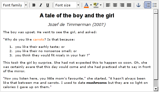
Default configuration of a WTextEdit
-
Nested Class Summary
Nested classes/interfaces inherited from class eu.webtoolkit.jwt.WObject
WObject.FormData -
Field Summary
Fields inherited from class eu.webtoolkit.jwt.WInteractWidget
dragTouchEndSlot_, dragTouchSlot_, noDefault -
Constructor Summary
ConstructorsConstructorDescriptionCreates a new text editor.WTextEdit(WContainerWidget parentContainer) Creates a new text editor.Creates a new text editor and initialize with given text.WTextEdit(String text, WContainerWidget parentContainer) Creates a new text editor and initialize with given text. -
Method Summary
Modifier and TypeMethodDescriptionprotected intboxBorder(Orientation orientation) Returns the widget's built-in border width.protected intboxPadding(Orientation orientation) Returns the widget's built-in padding.Returns a TinyMCE configuration setting's value.protected voidgetDomChanges(List<DomElement> result, WApplication app) Get DOM changes for this widget.Returns the extra plugins.Returns the content stylesheet.getToolBar(int i) Returns a tool bar configuration.intReturns the TinyMCE version.voidpropagateSetEnabled(boolean enabled) Propagates that a widget was enabled or disabled through children.voidremove()Destructor.rendered()Signal emitted when rendered.voidResizes the widget.voidsetConfigurationSetting(String name, Object value) Configure a TinyMCE setting.voidsetExtraPlugins(String plugins) Loads additional TinyMCE plugins.voidsetPlaceholderText(CharSequence placeholder) Sets the placeholder text.voidsetReadOnly(boolean readOnly) Sets the element read-only.voidsetStyleSheet(String uri) Sets the stylesheet for displaying the content.voidSets the content.voidsetToolBar(int i, String config) Configures a tool bar.Methods inherited from class eu.webtoolkit.jwt.WTextArea
getColumns, getCursorPosition, getRows, getSelectedText, getSelectionStart, getText, getValueText, hasSelectedText, setColumns, setFormData, setRows, setValueText, textInputMethods inherited from class eu.webtoolkit.jwt.WFormWidget
changed, enableAjax, getLabel, getPlaceholderText, getTabIndex, getValidator, isCanReceiveFocus, isReadOnly, refresh, render, setEnabled, setHidden, setToolTip, setValidator, validate, validated, validatorChangedMethods inherited from class eu.webtoolkit.jwt.WInteractWidget
clicked, doubleClicked, enterPressed, escapePressed, gestureChanged, gestureEnded, gestureStarted, getMouseOverDelay, isEnabled, keyPressed, keyWentDown, keyWentUp, load, mouseDragged, mouseMoved, mouseWentDown, mouseWentOut, mouseWentOver, mouseWentUp, mouseWheel, setDraggable, setDraggable, setDraggable, setDraggable, setMouseOverDelay, setPopup, touchEnded, touchMoved, touchStarted, unsetDraggableMethods inherited from class eu.webtoolkit.jwt.WWebWidget
addStyleClass, beingDeleted, blurred, callJavaScriptMember, childrenChanged, createDomElement, doJavaScript, escapeText, escapeText, escapeText, escapeText, find, findById, focussed, getAttributeValue, getBaseZIndex, getChildren, getClearSides, getDecorationStyle, getFloatSide, getHeight, getHtmlTagName, getId, getJavaScriptMember, getLineHeight, getMargin, getMaximumHeight, getMaximumWidth, getMinimumHeight, getMinimumWidth, getOffset, getPositionScheme, getScrollVisibilityMargin, getStyleClass, getToolTip, getVerticalAlignment, getVerticalAlignmentLength, getWidth, hasFocus, hasStyleClass, isDisabled, isHidden, isHiddenKeepsGeometry, isInline, isLoaded, isPopup, isRendered, isScrollVisibilityEnabled, isScrollVisible, isSetFirstFocus, isThemeStyleEnabled, isVisible, iterateChildren, jsStringLiteral, jsStringLiteral, manageWidget, parentResized, parentResized, propagateSetVisible, removeScript, removeStyleClass, scrollVisibilityChanged, setAttributeValue, setBaseZIndex, setCanReceiveFocus, setClearSides, setDecorationStyle, setDeferredToolTip, setDisabled, setFlexBox, setFloatSide, setFocus, setHiddenKeepsGeometry, setHtmlTagName, setId, setInline, setJavaScriptMember, setLineHeight, setLoadLaterWhenInvisible, setMargin, setMaximumSize, setMinimumSize, setObjectName, setOffsets, setParentWidget, setPositionScheme, setScrollVisibilityEnabled, setScrollVisibilityMargin, setSelectable, setStyleClass, setTabIndex, setThemeStyleEnabled, setVerticalAlignment, unescapeText, updateSignalConnection, voidEventSignal, widgetAdded, widgetRemovedMethods inherited from class eu.webtoolkit.jwt.WWidget
acceptDrops, acceptDrops, addCssRule, addCssRule, addJSignal, addStyleClass, animateHide, animateShow, createJavaScript, disable, dropEvent, enable, getDropTouch, getJsRef, getParent, hide, htmlText, isExposed, isGlobalWidget, isLayoutSizeAware, layoutSizeChanged, needsRerender, positionAt, positionAt, positionAt, positionAt, removeFromParent, removeStyleClass, removeWidget, render, resize, scheduleRender, scheduleRender, scheduleRender, setClearSides, setDeferredToolTip, setFocus, setHeight, setHidden, setLayoutSizeAware, setMargin, setMargin, setMargin, setMargin, setMargin, setOffsets, setOffsets, setOffsets, setOffsets, setOffsets, setToolTip, setVerticalAlignment, setWidth, show, stopAcceptDrops, toggleStyleClass, toggleStyleClass, trMethods inherited from class eu.webtoolkit.jwt.WObject
getObjectName
-
Constructor Details
-
WTextEdit
Creates a new text editor. -
WTextEdit
public WTextEdit()Creates a new text editor. -
WTextEdit
Creates a new text editor and initialize with given text.The
textshould be valid XHTML. -
WTextEdit
Creates a new text editor and initialize with given text.
-
-
Method Details
-
remove
public void remove()Destructor.- Overrides:
removein classWFormWidget- See Also:
-
getVersion
public int getVersion()Returns the TinyMCE version.This returns the configured version of TinyMCE (currently 3 or 4).
-
setText
Sets the content.The
textshould be valid XHTML.The default value is "".
-
setStyleSheet
Sets the stylesheet for displaying the content.The content is rendered using the rules defined in this stylesheet. The stylesheet is also used to derive additional styles that are available in the text editor, for example in the "styleselect" button.
Multiple stylesheets may be specified as a comma separated list.
-
getStyleSheet
Returns the content stylesheet.- See Also:
-
setExtraPlugins
Loads additional TinyMCE plugins.Wt loads by default only the plugin 'safari' (which adds support for the Safari web browser). Use this method to load additional plugins. Multiple plugins may be specified as a comma separated list.
The various plugins are described in the TinyMCE documentation.
Note: Plugins can only be loaded before the initial display of the widget.
-
getExtraPlugins
Returns the extra plugins.- See Also:
-
setToolBar
Configures a tool bar.This configures the buttons for the
i'thtool bar (with 0 <=i<= 3).TinyMCE 3
The syntax and available buttons is documented in the TinyMCE documentation.
The default config for the first tool bar (
i= 0) is: "fontselect, |, bold, italic, underline, |, fontsizeselect, |, forecolor, backcolor, |, justifyleft, justifycenter, justifyright, justifyfull, |, anchor, |, numlist, bullist".By default, the other three tool bars are disabled (
config= "").TinyMCE 4
The syntax and available buttons is documented in the TinyMCEdocumentation.
The default config for the first tool bar (
i= 0) is: "undo redo | styleselect | bold italic | link".Some buttons are only available after loading extra plugins using
setExtraPlugins().Note: The tool bar configuration can only be set before the initial display of the widget.
-
getToolBar
Returns a tool bar configuration.- See Also:
-
setConfigurationSetting
Configure a TinyMCE setting.A list of possible settings can be found at: https://www.tiny.cloud/docs/tinymce/5/configure/ or for older versions: https://github.com/tinymce/tinymce-docs/
The widget itself will also define a number of configuration settings and these may be overridden using this method.
-
getConfigurationSetting
Returns a TinyMCE configuration setting's value.An empty Any is returned when no value could be found for the provided argument.
-
setPlaceholderText
Sets the placeholder text.This method is not supported on
WTextEditand will thrown an exception instead.- Overrides:
setPlaceholderTextin classWFormWidget
-
setReadOnly
public void setReadOnly(boolean readOnly) Description copied from class:WFormWidgetSets the element read-only.A read-only form element cannot be edited, but the contents can still be selected.
By default, a form element area is not read-only.
- Overrides:
setReadOnlyin classWFormWidget- See Also:
-
propagateSetEnabled
public void propagateSetEnabled(boolean enabled) Description copied from class:WWidgetPropagates that a widget was enabled or disabled through children.When enabling or disabling a widget, you usually also want to disable contained children. This method is called by
setDisabled()to propagate its state to all children.You may want to reimplement this method if they wish to render differently when a widget is disabled. The default implementation will propagate the signal to all children.
- Overrides:
propagateSetEnabledin classWFormWidget
-
resize
Description copied from class:WWidgetResizes the widget.Specifies a fixed size for this widget, setting CSS
widthandheightproperties. By default a widget has automatic width and height, which sets a size for the widget following CSS rules.When the widget is not managed by a layout manager, the automatic (natural) size of a widget depends on whether the widget is a block or inline widget:
- a block widget takes by default the width of the parent, and the height that it needs based on its contents
- an inline widget takes the width and height that it needs based on its contents (possibly wrapping over multiple lines). The width and height of an inline widget cannot be changed (by the letter of CSS, although most browsers will react to it in varying ways).
When inserted in a layout manager, the size set will be used as a widget's preferred size, but the widget may be given a different size by the layout manager based on available space and stretch factors. The actual size given by a layout manager may be retrieved by making the widget "layout size aware", using
setLayoutSizeAware(). If you have defined a"wtResize()"JavaScript method for the widget, then this method will also be called.The default width and height of a widget is
WLength.Auto.- Overrides:
resizein classWWebWidget- See Also:
-
rendered
Signal emitted when rendered.A text edit is instantiated asynchronously as it depends on additional JavaScript libraries and initialization. This signal is emitted when the component is initialized. The underlying TinyMCE editor component is accessible as
WWidget.getJsRef()+ ".ed". -
getDomChanges
Description copied from class:WWebWidgetGet DOM changes for this widget.This is an internal function, and should not be called directly, or be overridden!
- Overrides:
getDomChangesin classWWebWidget
-
boxPadding
Description copied from class:WWidgetReturns the widget's built-in padding.This is used by the layout managers to correct for a built-in padding which interferes with setting a widget's width (or height) to 100%.
A layout manager needs to set the width to 100% only for form widgets (
WTextArea,WLineEdit,WComboBox, etc...). Therefore, only for those widgets this needs to return the padding (the default implementation returns 0).For form widgets, the padding depends on the specific browser/platform combination, unless an explicit padding is set for the widget.
When setting an explicit padding for the widget using a style class, you will want to reimplement this method to return this padding in case you want to set the widget inside a layout manager.
- Overrides:
boxPaddingin classWTextArea- See Also:
-
boxBorder
Description copied from class:WWidgetReturns the widget's built-in border width.This is used by the layout managers to correct for a built-in border which interferes with setting a widget's width (or height) to 100%.
A layout manager needs to set the width to 100% only for form widgets (
WTextArea,WLineEdit,WComboBox, etc...). Therefore, only for those widgets this needs to return the border width (the default implementation returns 0).For form widgets, the border width depends on the specific browser/platform combination, unless an explicit border is set for the widget.
When setting an explicit border for the widget using a style class, you will want to reimplement this method to return this border width, in case you want to set the widget inside a layout manager.
-