Class WTreeView
The view displays data from a WAbstractItemModel in a tree or tree table. It provides
incremental rendering, allowing the display of data models of any size efficiently, without
excessive use of client- or serverside resources.
The rendering (and editing) of items is handled by a WAbstractItemDelegate, by default
it uses WItemDelegate which renders data of all predefined roles (see also ItemDataRole), including text, icons, checkboxes, and tooltips.
The view may support editing of items, if the model indicates support (see the ItemFlag.Editable flag). You can define triggers that initiate editing of an item using WAbstractItemView#setEditTriggers(). The
actual editing is provided by the item delegate (you can set an appropriate delegate for one
column using WAbstractItemView#setItemDelegateForColumn()). Using WAbstractItemView#setEditOptions() you can
customize if and how the view deals with multiple editors.
By default, all but the first columns are given a width of 150px, and the first column takes
the remaining size. Note that this may have as consequence that the first column's size
is reduced to 0. Column widths of all columns, including the first column, can be set through
the API method setColumnWidth(), and
also by the user using handles provided in the header.
Optionally, the treeview may be configured so that the first column is always visible while scrolling through the other columns, which may be convenient if you wish to display a model with many columns. Use setColumn1Fixed() to enable this behaviour.
If the model supports sorting (WAbstractItemModel#sort()), such as the WStandardItemModel, then you can enable sorting
buttons in the header, using WAbstractItemView#setSortingEnabled().
You can allow selection on row or item level (using WAbstractItemView#setSelectionBehavior()), and selection of single or multiple items (using
WAbstractItemView#setSelectionMode()), and listen for changes in the selection using the WAbstractItemView.selectionChanged() signal.
You may enable drag & drop support for this view, with awareness of the items in the
model. When enabling dragging (see WAbstractItemView#setDragEnabled()), the current selection may be dragged, but only when all
items in the selection indicate support for dragging (controlled by the ItemFlag.DragEnabled flag), and if the model indicates a mime-type (controlled by WAbstractItemModel.getMimeType()). Likewise, by enabling support for dropping (see WAbstractItemView#setDropsEnabled()), the
treeview may receive a drop event on a particular item, at least if the item indicates support
for drops (controlled by the ItemFlag.DropEnabled flag).
You may also react to mouse click events on any item, by connecting to one of the WAbstractItemView.clicked() or WAbstractItemView.doubleClicked() signals.
Graceful degradation
The view provides a virtual scrolling behavior which relies on Ajax availability. When Ajax is
not available, a page navigation bar is used instead, see WAbstractItemView.getCreatePageNavigationBar(). In that case, the widget needs to be given an
explicit height using resize() which
determines the number of rows that are displayed at a time.
A snapshot of the WTreeView:
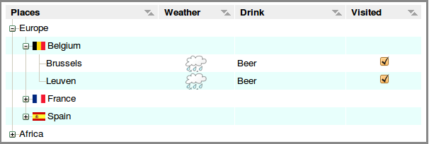
WTreeView example (default)
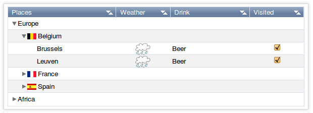
WTreeView example (polished)
-
Nested Class Summary
Nested classes/interfaces inherited from class eu.webtoolkit.jwt.WObject
WObject.FormData -
Field Summary
Fields inherited from class eu.webtoolkit.jwt.WAbstractItemView
enabledDropLocations_, uDragWidget_ -
Constructor Summary
ConstructorsConstructorDescriptionCreates a new tree view.WTreeView(WContainerWidget parentContainer) Creates a new tree view. -
Method Summary
Modifier and TypeMethodDescriptionvoidcollapse(WModelIndex index) Collapses a node.voidCollapse all expanded nodes.Signal emitted when a node is collapsed.protected voidProgresses to an Ajax-enabled widget.voidexpand(WModelIndex index) Expands a node.expanded()Signal emitted when a node is expanded.voidexpandToDepth(int depth) Expands all nodes to a depth.intReturns the current page.intReturns the number of pages.intReturns the page size.booleanisExpanded(WModelIndex index) Returns whether a node is expanded.booleanReturns whether toplevel items are decorated.itemWidget(WModelIndex index) Returns the widget that renders an item.voidremove()Destructor.protected voidrender(EnumSet<RenderFlag> flags) Renders the widget.voidResizes the widget.scrolled()Signal emitted when scrolling.voidscrollTo(WModelIndex index, ScrollHint hint) Scrolls the view to an item.voidsetAlternatingRowColors(boolean enable) Sets if alternating row colors are to be used.voidsetColumnHidden(int column, boolean hidden) Changes the visibility of a column.voidsetColumnWidth(int column, WLength width) Sets the column width.voidsetCurrentPage(int page) Sets the current page.voidsetExpanded(WModelIndex index, boolean expanded) Expands or collapses a node.voidsetHeaderHeight(WLength height) Sets the header height.voidSets the CSS Id.voidsetModel(WAbstractItemModel model) Sets the model.voidsetRootIsDecorated(boolean show) Sets whether toplevel items are decorated.voidsetRowHeaderCount(int count) Configures the number of columns that are used as row headers.voidsetRowHeight(WLength rowHeight) Sets the row height.Methods inherited from class eu.webtoolkit.jwt.WAbstractItemView
clearSelection, clicked, closeEditor, closeEditor, closeEditors, closeEditors, columnResized, createExtraHeaderWidget, createHeaderWidget, doubleClicked, dropEvent, dropEvent, edit, extraHeaderWidget, getColumnAlignment, getColumnWidth, getCreatePageNavigationBar, getEditOptions, getEditTriggers, getEnabledDropLocations, getHeaderHeight, getHeaderItemDelegate, getItemDelegate, getItemDelegate, getItemDelegate, getItemDelegateForColumn, getModel, getRootIndex, getRowHeaderCount, getRowHeight, getSelectedIndexes, getSelectionBehavior, getSelectionMode, getSelectionModel, getSortColumn, getSortOrder, handleTouchEnd, handleTouchMove, handleTouchSelect, handleTouchStart, hasAlternatingRowColors, headerClicked, headerDoubleClicked, headerMouseWentDown, headerMouseWentUp, hideColumn, horizontalHeaderAlignment, isColumnHidden, isColumnResizeEnabled, isEditing, isSelected, isSortEnabled, isSortingEnabled, isSortingEnabled, isValid, keyPressed, keyWentDown, keyWentUp, modelHeaderDataChanged, mouseWentDown, mouseWentUp, pageChanged, scrollTo, select, select, selectionChanged, setColumnAlignment, setColumnResizeEnabled, setDragEnabled, setDropsEnabled, setEditOptions, setEditOptions, setEditTriggers, setEditTriggers, setEnabledDropLocations, setEnabledDropLocations, setHeaderAlignment, setHeaderAlignment, setHeaderClickSortEnabled, setHeaderItemDelegate, setHeaderWordWrap, setItemDelegate, setItemDelegateForColumn, setRootIndex, setSelectedIndexes, setSelectionBehavior, setSelectionMode, setSortingEnabled, setSortingEnabled, shiftEditorColumns, shiftEditorRows, showColumn, sortByColumn, touchEnded, touchMoved, touchStart, touchStarted, validateEditor, validateEditors, verticalHeaderAlignmentMethods inherited from class eu.webtoolkit.jwt.WCompositeWidget
addStyleClass, boxBorder, boxPadding, callJavaScriptMember, doJavaScript, find, findById, getAttributeValue, getBaseZIndex, getChildren, getClearSides, getDecorationStyle, getFloatSide, getHeight, getId, getImplementation, getJavaScriptMember, getLineHeight, getMargin, getMaximumHeight, getMaximumWidth, getMinimumHeight, getMinimumWidth, getObjectName, getOffset, getPositionScheme, getScrollVisibilityMargin, getStyleClass, getTabIndex, getTakeImplementation, getToolTip, getVerticalAlignment, getVerticalAlignmentLength, getWidth, hasFocus, hasStyleClass, isCanReceiveFocus, isDisabled, isEnabled, isHidden, isHiddenKeepsGeometry, isInline, isLoaded, isPopup, isScrollVisibilityEnabled, isScrollVisible, isSetFirstFocus, isThemeStyleEnabled, isVisible, load, propagateSetEnabled, propagateSetVisible, refresh, removeStyleClass, removeWidget, scrollVisibilityChanged, setAttributeValue, setCanReceiveFocus, setClearSides, setDecorationStyle, setDeferredToolTip, setDisabled, setFloatSide, setFocus, setHidden, setHiddenKeepsGeometry, setImplementation, setInline, setJavaScriptMember, setLineHeight, setMargin, setMaximumSize, setMinimumSize, setObjectName, setOffsets, setPopup, setPositionScheme, setScrollVisibilityEnabled, setScrollVisibilityMargin, setSelectable, setStyleClass, setTabIndex, setThemeStyleEnabled, setToolTip, setVerticalAlignmentMethods inherited from class eu.webtoolkit.jwt.WWidget
acceptDrops, acceptDrops, addCssRule, addCssRule, addJSignal, addStyleClass, animateHide, animateShow, createJavaScript, disable, dropEvent, enable, getDropTouch, getJsRef, getParent, hide, htmlText, isExposed, isGlobalWidget, isLayoutSizeAware, isRendered, layoutSizeChanged, needsRerender, positionAt, positionAt, removeFromParent, removeStyleClass, render, resize, scheduleRender, scheduleRender, scheduleRender, setClearSides, setDeferredToolTip, setFocus, setHeight, setHidden, setLayoutSizeAware, setMargin, setMargin, setMargin, setMargin, setMargin, setOffsets, setOffsets, setOffsets, setOffsets, setOffsets, setToolTip, setVerticalAlignment, setWidth, show, stopAcceptDrops, toggleStyleClass, toggleStyleClass, trMethods inherited from class eu.webtoolkit.jwt.WObject
setFormData
-
Constructor Details
-
WTreeView
Creates a new tree view. -
WTreeView
public WTreeView()Creates a new tree view.
-
-
Method Details
-
remove
public void remove()Description copied from class:WWidgetDestructor.Deletes a widget and all contained contents.
- Overrides:
removein classWAbstractItemView- See Also:
-
setExpanded
Expands or collapses a node. -
isExpanded
Returns whether a node is expanded. -
collapse
Collapses a node. -
collapseAll
public void collapseAll()Collapse all expanded nodes. -
expand
Expands a node. -
expandToDepth
public void expandToDepth(int depth) Expands all nodes to a depth.Expands all nodes to the given
depth. A depth of 1 corresponds to the top level nodes.- See Also:
-
setRootIsDecorated
public void setRootIsDecorated(boolean show) Sets whether toplevel items are decorated.By default, top level nodes have expand/collapse and other lines to display their linkage and offspring, like any node.
By setting
showtofalse, you can hide these decorations for root nodes, and in this way mimic a plain list. You could also consider using aWTableViewinstead. -
isRootDecorated
public boolean isRootDecorated()Returns whether toplevel items are decorated.- See Also:
-
resize
Description copied from class:WWidgetResizes the widget.Specifies a fixed size for this widget, setting CSS
widthandheightproperties. By default a widget has automatic width and height, which sets a size for the widget following CSS rules.When the widget is not managed by a layout manager, the automatic (natural) size of a widget depends on whether they widget is a block or inline widget:
- a block widget takes by default the width of the parent, and the height that it needs based on its contents
- an inline widget takes the width and height that it needs based on its contents (possibly wrapping over multiple lines). The width and height of an inline widget cannot be changed (by the letter of CSS, although most browsers will react to it in varying ways).
When inserted in a layout manager, the size set will be used as a widget's preferred size, but the widget may be given a different size by the layout manager based on available space and stretch factors. The actual size given by a layout manager may be retrieved by making the widget "layout size aware", using
setLayoutSizeAware(). If you have defined a"wtResize()"JavaScript method for the widget, then this method will also be called.The default width and height of a widget is
WLength.Auto.- Overrides:
resizein classWCompositeWidget- See Also:
-
collapsed
Signal emitted when a node is collapsed. -
expanded
Signal emitted when a node is expanded. -
itemWidget
Description copied from class:WAbstractItemViewReturns the widget that renders an item.This returns the widget that renders the given item. This may return 0 if the item is currently not rendered.
This widget has been created by an item delegate, and usually an item delegate is involved when updating it.
- Specified by:
itemWidgetin classWAbstractItemView
-
setModel
Description copied from class:WAbstractItemViewSets the model.The View will display data of the given
modeland changes in the model are reflected by the View.The initial model is
null.- Overrides:
setModelin classWAbstractItemView- See Also:
-
setColumnWidth
Sets the column width.For a model with
WAbstractItemModel#getColumnCount()==N, the initial width of columns 1..Nis set to 150 pixels, and column 0 will take all remaining space.Note: The actual space occupied by each column is the column width augmented by 7 pixels for internal padding and a border.
- Specified by:
setColumnWidthin classWAbstractItemView- See Also:
-
setAlternatingRowColors
public void setAlternatingRowColors(boolean enable) Description copied from class:WAbstractItemViewSets if alternating row colors are to be used.Configure whether rows get alternating background colors, defined by the current CSS theme.
The default value is
false.- Overrides:
setAlternatingRowColorsin classWAbstractItemView
-
setRowHeight
Description copied from class:WAbstractItemViewSets the row height.The view renders all rows with a same height. This method configures this row height.
The default value is 20 pixels.
Note: The height must be specified in
LengthUnit.Pixelunits.- Overrides:
setRowHeightin classWAbstractItemView- See Also:
-
setHeaderHeight
Description copied from class:WAbstractItemViewSets the header height.The default value is 20 pixels.
Note: The height must be specified in
LengthUnit.Pixelunits.- Overrides:
setHeaderHeightin classWAbstractItemView
-
setColumnHidden
public void setColumnHidden(int column, boolean hidden) Description copied from class:WAbstractItemViewChanges the visibility of a column.- Overrides:
setColumnHiddenin classWAbstractItemView- See Also:
-
setRowHeaderCount
public void setRowHeaderCount(int count) Description copied from class:WAbstractItemViewConfigures the number of columns that are used as row headers.An item view does not use the vertical header data from the model in any way, but instead you can configure data in the first column(s) to be used as a row headers.
These columns will not scroll horizontally together with the rest of the model.
The default value is 0.
Note: Currently, this property must be set before any other settings of the view and only a value of 0 or 1 is supported.
- Overrides:
setRowHeaderCountin classWAbstractItemView
-
getPageCount
public int getPageCount()Description copied from class:WAbstractItemViewReturns the number of pages.When Ajax/JavaScript is not available, the view will use a paging navigation bar to allow scrolling through the data. This returns the number of pages currently shown.
- Specified by:
getPageCountin classWAbstractItemView- See Also:
-
getPageSize
public int getPageSize()Description copied from class:WAbstractItemViewReturns the page size.When Ajax/JavaScript is not available, the view will use a paging navigation bar to allow scrolling through the data. This returns the number of items per page.
- Specified by:
getPageSizein classWAbstractItemView- See Also:
-
getCurrentPage
public int getCurrentPage()Description copied from class:WAbstractItemViewReturns the current page.When Ajax/JavaScript is not available, the view will use a paging navigation bar to allow scrolling through the data. This returns the current page (between 0 and
getPageCount()- 1).- Specified by:
getCurrentPagein classWAbstractItemView- See Also:
-
setCurrentPage
public void setCurrentPage(int page) Description copied from class:WAbstractItemViewSets the current page.When Ajax/JavaScript is not available, the view will use a paging navigation bar to allow scrolling through the data. This method can be used to change the current page.
- Specified by:
setCurrentPagein classWAbstractItemView- See Also:
-
scrollTo
Description copied from class:WAbstractItemViewScrolls the view to an item.Scrolls the view to ensure that the item which represents the provided
indexis visible. Ahintmay indicate how the item should appear in the viewport (if possible).Note: Currently only implemented to scroll to the correct row, not taking into account the column.
- Specified by:
scrollToin classWAbstractItemView
-
scrolled
Description copied from class:WAbstractItemViewSignal emitted when scrolling.Note: Works only if ajax is available.
- Specified by:
scrolledin classWAbstractItemView
-
setId
Description copied from class:WWidgetSets the CSS Id.Sets a custom Id. Note that the Id must be unique across the whole widget tree, can only be set right after construction and cannot be changed. This is mostly useful for in tests using a test plan that manipulates DOM elements by Id.
By default, auto-generated id's are used.
Note: An id must start with a letter ([A-Za-z]), followed by one or more letters, digits ([0-9]), hyphens ("-"), underscores ("_"), colons (":"), and periods (".").
Warning: We recommend that you leave the id of a widget unchanged. JWt uses the id to identify widgets in the JavaScript it generates, and this can often leads to bugs. If you do change the id, only change the id right after widget construction. However, usually there's a more preferable alternative, like setting the object name (
WObject#setObjectName()), or adding style classes (addStyleClass()).- Overrides:
setIdin classWCompositeWidget- See Also:
-
render
Description copied from class:WWidgetRenders the widget.This function renders the widget (or an update for the widget), after this has been scheduled using
scheduleRender().The default implementation will render the widget by serializing changes to JavaScript and HTML. You may want to reimplement this widget if you have been postponing some of the layout / rendering implementation until the latest moment possible. In that case you should make sure you call the base implementation however.
- Overrides:
renderin classWCompositeWidget
-
enableAjax
protected void enableAjax()Description copied from class:WWidgetProgresses to an Ajax-enabled widget.This method is called when the progressive bootstrap method is used, and support for AJAX has been detected. The default behavior will upgrade the widget's event handling to use AJAX instead of full page reloads, and propagate the call to its children.
You may want to reimplement this method if you want to make changes to widget when AJAX is enabled. You should always call the base implementation.
- Overrides:
enableAjaxin classWAbstractItemView- See Also:
-