Class WTabWidget
This widget combines a horizontal WMenu with a WStackedWidget, and a tab-like
look.
A tab widget will place the tab bar on top of the contents, and fit the contents below it.
Usage example:
 WTabWidget examples = new WTabWidget(this);

 examples.addTab(helloWorldExample(), "Hello World");
 examples.addTab(chartExample(), "Charts");
 examples.addTab(new WText("A WText"), "WText");

 examples.currentChanged().addListener(this, new Signal.Listener(){
 public void trigger() {
 //custom code
 }
 });
 examples.setInternalPathEnabled();
 examples.setInternalBasePath("/examples");
CSS
The tab widget is styled by the current CSS theme.
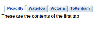
An example WTabWidget (default) | 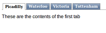
An example WTabWidget (polished) |
-
Nested Class Summary
Nested classes/interfaces inherited from class eu.webtoolkit.jwt.WObject
WObject.FormData -
Constructor Summary
ConstructorsConstructorDescriptionCreates a new tab widget.WTabWidget(WContainerWidget parentContainer) Creates a new tab widget. -
Method Summary
Modifier and TypeMethodDescriptionfinal WMenuItemaddTab(WWidget child, CharSequence label) Adds a new tab, with child as content, and the given label.addTab(WWidget child, CharSequence label, ContentLoading loadPolicy) Adds a new tab, with child as content, and the given label.voidcloseTab(int index) Closes a tab atindex.Signal emitted when the user activates a tab.Returns the contents stack.intgetCount()Returns the number of tabs.intReturns the index of the activated tab.Returns the item of the activated tab.Returns the widget of the activated tab.intgetIndexOf(WWidget widget) Returns the index of the tab of the given content widget.Returns the internal base path.getItemAt(int index) Returns the item at the given tab index.getTabText(int index) Returns the label for a tab.getTabToolTip(int index) Returns the tooltip for a tab.getWidget(int index) Returns the content widget at the given tab index.final WMenuIteminsertTab(int index, WWidget child, CharSequence label) Inserts a new tab, with child as content, and the given label.insertTab(int index, WWidget child, CharSequence label, ContentLoading loadPolicy) Inserts a new tab, with child as content, and the given label.booleanReturns whether internal paths are enabled.booleanisTabCloseable(int index) Returns whether a tab is closeable.booleanisTabEnabled(int index) Returns whether a tab is enabled.booleanisTabHidden(int index) Returns whether a tab is hidden.Removes a tab item.voidsetCurrentIndex(int index) Activates the tab at index.voidsetCurrentWidget(WWidget widget) Activates the tab showing the given widgetvoidsetInternalBasePath(String path) Sets the internal base path.final voidEnables internal paths for items.voidsetInternalPathEnabled(String basePath) Enables internal paths for items.final voidsetOverflow(Overflow value) Sets how overflow of contained children must be handled.final voidsetOverflow(Overflow value, Orientation orientatio, Orientation... orientation) Sets how overflow of contained children must be handled.voidsetOverflow(Overflow value, EnumSet<Orientation> orientation) Sets how overflow of contained children must be handled.voidsetTabCloseable(int index, boolean closeable) Make it possible to close a tab interactively or bycloseTab().voidsetTabEnabled(int index, boolean enable) Enables or disables a tab.voidsetTabHidden(int index, boolean hidden) Hides or shows a tab.voidsetTabText(int index, CharSequence label) Changes the label for a tab.voidsetTabToolTip(int index, CharSequence tip) Sets the tooltip for a tab.Signal emitted when the user closes a tab.Methods inherited from class eu.webtoolkit.jwt.WCompositeWidget
addStyleClass, boxBorder, boxPadding, callJavaScriptMember, doJavaScript, enableAjax, find, findById, getAttributeValue, getBaseZIndex, getChildren, getClearSides, getDecorationStyle, getFloatSide, getHeight, getId, getImplementation, getJavaScriptMember, getLineHeight, getMargin, getMaximumHeight, getMaximumWidth, getMinimumHeight, getMinimumWidth, getObjectName, getOffset, getPositionScheme, getScrollVisibilityMargin, getStyleClass, getTabIndex, getTakeImplementation, getToolTip, getVerticalAlignment, getVerticalAlignmentLength, getWidth, hasFocus, hasStyleClass, isCanReceiveFocus, isDisabled, isEnabled, isHidden, isHiddenKeepsGeometry, isInline, isLoaded, isPopup, isScrollVisibilityEnabled, isScrollVisible, isSetFirstFocus, isThemeStyleEnabled, isVisible, load, propagateSetEnabled, propagateSetVisible, refresh, remove, removeStyleClass, removeWidget, render, resize, scrollVisibilityChanged, setAttributeValue, setCanReceiveFocus, setClearSides, setDecorationStyle, setDeferredToolTip, setDisabled, setFloatSide, setFocus, setHidden, setHiddenKeepsGeometry, setId, setImplementation, setInline, setJavaScriptMember, setLineHeight, setMargin, setMaximumSize, setMinimumSize, setObjectName, setOffsets, setPopup, setPositionScheme, setScrollVisibilityEnabled, setScrollVisibilityMargin, setSelectable, setStyleClass, setTabIndex, setThemeStyleEnabled, setToolTip, setVerticalAlignmentMethods inherited from class eu.webtoolkit.jwt.WWidget
acceptDrops, acceptDrops, addCssRule, addCssRule, addJSignal, addStyleClass, animateHide, animateShow, createJavaScript, disable, dropEvent, enable, getDropTouch, getJsRef, getParent, hide, htmlText, isExposed, isGlobalWidget, isLayoutSizeAware, isRendered, layoutSizeChanged, needsRerender, positionAt, positionAt, removeFromParent, removeStyleClass, render, resize, scheduleRender, scheduleRender, scheduleRender, setClearSides, setDeferredToolTip, setFocus, setHeight, setHidden, setLayoutSizeAware, setMargin, setMargin, setMargin, setMargin, setMargin, setOffsets, setOffsets, setOffsets, setOffsets, setOffsets, setToolTip, setVerticalAlignment, setWidth, show, stopAcceptDrops, toggleStyleClass, toggleStyleClass, trMethods inherited from class eu.webtoolkit.jwt.WObject
setFormData
-
Constructor Details
-
WTabWidget
Creates a new tab widget. -
WTabWidget
public WTabWidget()Creates a new tab widget.
-
-
Method Details
-
addTab
Adds a new tab, with child as content, and the given label.Returns the menu item that implements the tab item.
-
addTab
Adds a new tab, with child as content, and the given label. -
insertTab
Inserts a new tab, with child as content, and the given label.Returns the menu item that implements the tab item.
-
insertTab
Inserts a new tab, with child as content, and the given label. -
removeTab
Removes a tab item.- See Also:
-
getCount
public int getCount()Returns the number of tabs. -
getWidget
Returns the content widget at the given tab index. -
getItemAt
Returns the item at the given tab index. -
getIndexOf
Returns the index of the tab of the given content widget.If the widget is not in this tab widget, then -1 is returned.
-
setCurrentIndex
public void setCurrentIndex(int index) Activates the tab at index. -
getCurrentIndex
public int getCurrentIndex()Returns the index of the activated tab. -
setCurrentWidget
Activates the tab showing the given widget -
getCurrentWidget
Returns the widget of the activated tab. -
getCurrentItem
Returns the item of the activated tab. -
setTabEnabled
public void setTabEnabled(int index, boolean enable) Enables or disables a tab.Enables or disables the tab at
index. A disabled tab cannot be activated. -
isTabEnabled
public boolean isTabEnabled(int index) Returns whether a tab is enabled. -
setTabHidden
public void setTabHidden(int index, boolean hidden) Hides or shows a tab.Hides or shows the tab at
index. -
isTabHidden
public boolean isTabHidden(int index) Returns whether a tab is hidden. -
setTabCloseable
public void setTabCloseable(int index, boolean closeable) Make it possible to close a tab interactively or bycloseTab().A tab that has been closed is marked as hidden, but not removed from the menu.
- See Also:
-
isTabCloseable
public boolean isTabCloseable(int index) Returns whether a tab is closeable. -
setTabText
Changes the label for a tab. -
getTabText
Returns the label for a tab. -
setTabToolTip
Sets the tooltip for a tab.The tooltip is shown when the user hovers over the label.
-
getTabToolTip
Returns the tooltip for a tab. -
setInternalPathEnabled
Enables internal paths for items.The menu participates in the internal path by changing the internal path when an item has been selected, and listening for path changes to react to path selections. As a consequence this allows the user to bookmark the current menu selection and revisit it later, use back/forward buttons to navigate through history of visited menu items, and allows indexing of pages.
For each menu item,
WMenuItem.getPathComponent()is appended to thebasePath, which defaults to the internal path (WApplication.getInternalPath()). A '/' is appended to the base path, to turn it into a folder, if needed.By default, menu interaction does not change the application internal path.
- See Also:
-
setInternalPathEnabled
public final void setInternalPathEnabled()Enables internal paths for items. -
isInternalPathEnabled
public boolean isInternalPathEnabled()Returns whether internal paths are enabled.- See Also:
-
setInternalBasePath
Sets the internal base path.A '/' is appended to turn it into a folder, if needed.
-
getInternalBasePath
Returns the internal base path.The default value is the application's internalPath (
WApplication.getInternalPath()) that was recorded whensetInternalPathEnabled()was called, and together with eachWMenuItem.getPathComponent()determines the paths for each item.For example, if
getInternalBasePath()is"/examples/"and pathComponent() for a particular item is"charts/", then the internal path for that item will be"/examples/charts/".- See Also:
-
currentChanged
Signal emitted when the user activates a tab.The index of the newly activated tab is passed as an argument.
-
closeTab
public void closeTab(int index) Closes a tab atindex.A tab that has been closed is marked as hidden, but not removed from the menu.
-
tabClosed
Signal emitted when the user closes a tab.The index of the closed tab is passed as an argument.
-
getContentsStack
Returns the contents stack.The tab widget is implemented as a
WMenu+WStackedWidgetwhich displays the contents. This method returns a reference to this contents stack. -
setOverflow
Sets how overflow of contained children must be handled. -
setOverflow
Sets how overflow of contained children must be handled.Calls
setOverflow(value, EnumSet.of(orientatio, orientation)) -
setOverflow
Sets how overflow of contained children must be handled.Calls
setOverflow(value, EnumSet.of
 (Orientation.Horizontal, Orientation.Vertical))
-